Resource Productivity
Last Updated: Version R2601This set of dashboards provides valuable details about batches and documents based on a specified period of time. Use this data to evaluate user tasks, and the length of time required to complete tasks. This data can help improve efficiency by determining the average time spent on a task.
The charts are comprised of three criteria: time period, batches and document data.
Topics:
To set the time period
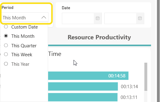
You can filter all data in these dashboard based on time period. The data options at the top of the screen provide the ability to choose from presets such as This Month, This Quarter, This Week, or this Year or to select a custom date range using the date fields.

To change the period, select an option from the Period list, shown below. The Selected Date field updates after you change the selection, and the charts are updated according to the new time period.
If you choose Custom Date, you need to use the Data selection option to choose a start and end date. These fields are only available when Custom Date is selected in the Period list.
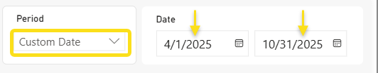
After you use the calendar option to select a start and end date, the Selected Date field is updated accordingly, shown below.

After selecting a Custom Date, to revert back to a standard time period from the Period list (i.e. This Month, This Year, etc.), you must click the Clear option to clear the date fields. Hover over the date box and select Clear selections when it pops up
To set the criteria
Criteria used to create these dashboards are based on batch and document data. From each list, select one or more Batch types, and one or more Documents. The charts are updated automatically after any new selection. By default, filters are applied for All batches and All documents.

To browse the data
There are five individual charts and one table provided on the Resource Productivity tab. As you click on entries in the chart, the table below will update to filter data. Each chart is described below.
Completed Task Count
This chart provides a detailed breakdown of tasks and the processing time for all users. It offers insights into the number of tasks completed, helping to identify any potential areas of inefficiency. The chart provides the top 5 results, with a scroll bar to view additional results.
Details in this chart are:
-
Total number of documents that created by each user (including documents that do not have a Document Type assigned)
-
Tasks include actions such as uploading, scanning, approving document. Note that each action on a document is counted separately for the selected filters.
-
The Y axis indicates the username; the X axis indicates the document count created by that user
Shortest Processing Time
This chart displays a list of users who have spent the least amount of time performing the tasks on the portal. This visual can help to identify users who are most efficient in completing tasks, providing quick insights into task performance and potential areas for process improvement. The chart provides the top 5 results, with a scroll bar to view additional results.
Details in this chart are:
-
Users who have spent the least amount of time performing the tasks on the portal.
-
Count for the average total time of each step of the user required for the document including all stages: Completed, Confirmation, Validation, Review, New Batch (including documents that do not have a Document Type assigned.
-
The Y axis indicates the username; the X axis indicates the total average processing time of each task for that user, using the display format HH:MM:SS.
Longest Processing Time
This chart provides a list of users who have spent the most time performing specific tasks on the portal. This visual can help to identify users who spend the longest time when completing tasks, providing quick insights into task performance and potential areas for process improvement.
Details in this chart are:
-
Users who have spent the most amount of time performing the tasks on the portal.
-
Count for the average total time of each step of the user required for the document including all stages: Completed, Confirmation, Validation, Review, New Batch (including documents that do not have a Document Type assigned.
-
The Y axis indicates the username; the X axis indicates the total average processing time of each task for that user, using the display format HH:MM:SS.
Most Accurate / Least Accurate Indexing
These charts are very similar, and both are described below. Each chart displays a list of users who are the most or least accurate in indexing/validation compared to values that were changed in confirmation, providing insights into user accuracy and highlights potential areas for process improvement.
These visuals only apply to batch types with fields flagged for confirmation.
Details in this chart are:
-
A count of the total fields that were corrected or changed in confirmation stage of all documents created by that user over the total fields of all documents created by the same user (total changed fields/total fields)
-
The most accurate indicates the least number of changes (percentage) whereas the least accurate indicates the highest number of changes (percentage).
-
The Y axis indicates the username; the X axis indicates the total fields that were corrected or changed by that user.
Count of task and average time completed chart
Use the chart located at the bottom of the screen to view the number of tasks completed vs. the average time spent on each task to identify possible improvements. You can filter the chart based on user or batch type. You can then sort columns based on ascending or descending values. As you click on specific rows in the table, the charts above update to reflect your selections.
